
Android icons are integral components of the Android operating system, providing users with visual cues that enhance their interaction with apps, notifications, and system functionalities. Understanding the various types of icons in Android can help developers create more user-friendly interfaces, and it can also assist users in navigating their devices more efficiently. This guide explores the different types of Android icons, their purposes, design guidelines, and best practices.
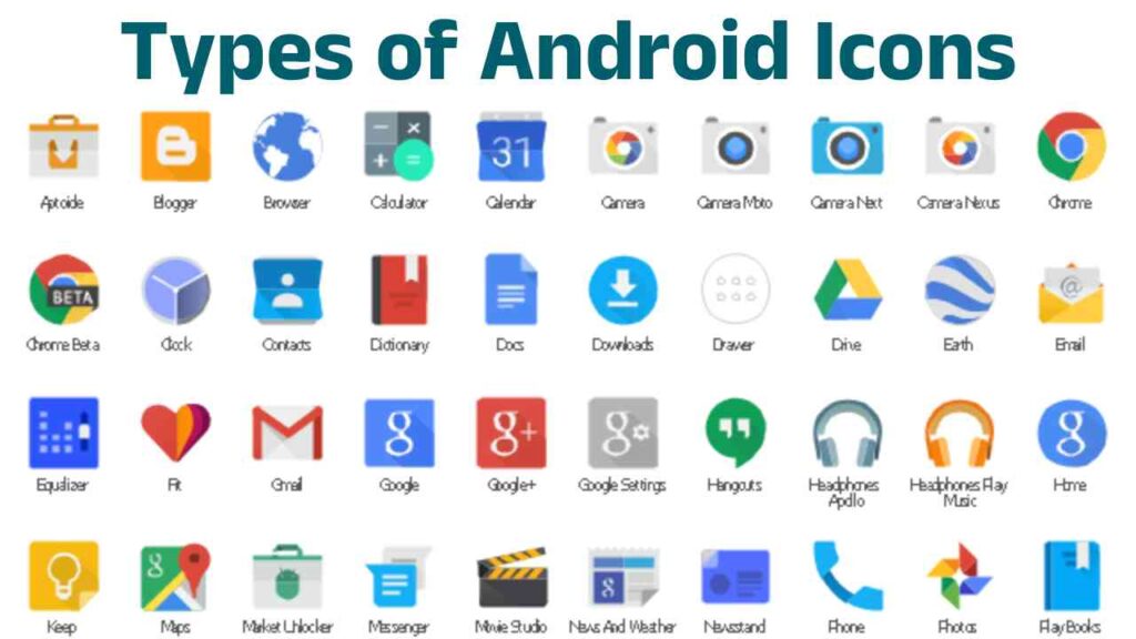
1. Application Icons
Application icons are the primary visual representations of apps on an Android device. These icons serve as shortcuts to launch applications and are prominently displayed on the home screen and app drawer.
a. Launcher Icons
Launcher icons are the images users tap to open applications. They should be designed to be clear and easily recognizable, even at small sizes. Android provides guidelines for designing launcher icons, including:
- Size: The standard size for launcher icons is 48×48 dp (density-independent pixels) for mdpi devices, scaling up for higher densities (hdpi, xhdpi, xxhdpi, xxxhdpi).
- Shape: Android 8.0 (Oreo) introduced adaptive icons, which consist of a foreground and a background layer. The foreground can be any shape, but the system will mask it into a geometric shape (like a circle or square) based on the device’s theme.
- Design: Icons should be simple, using limited colors and shapes to ensure clarity and impact. They should also be representative of the app’s purpose.
b. Notification Icons
Notification icons appear in the status bar and notification shade. They inform users about background activities, updates, or alerts from apps.
- Size: Notification icons are typically 24×24 dp for small icons.
- Color: They should be white or light-colored to stand out against a dark status bar.
- Design: Use simple shapes and avoid unnecessary details, as they need to be recognizable quickly.
2. System Icons
System icons represent core functionalities and settings within the Android operating system. They appear in various contexts, including the status bar, quick settings, and settings menu.
a. Status Bar Icons
Status bar icons indicate the current state of the device, such as battery level, connectivity status, and notifications. Common status bar icons include:
- Battery Indicator: Shows the current battery level, often displayed as a battery icon that can include percentages.
- Network Connectivity: Icons for Wi-Fi, mobile data, and Bluetooth connectivity indicate whether these services are active.
- Alarm: A small clock icon that indicates when an alarm is set.
b. Quick Settings Icons
Quick settings icons provide shortcuts to frequently used settings like Wi-Fi, Bluetooth, Airplane mode, and Do Not Disturb. These icons are designed for quick access and often use recognizable symbols.
- Design: They should maintain consistency in size and color, typically 24×24 dp for the icon itself, with clear symbols.
- Color Scheme: Use a cohesive color palette that fits within the overall theme of the Android interface.
3. Action Icons
Action icons represent specific actions within applications and are typically displayed in the app toolbar or within the app’s interface.
a. Floating Action Button (FAB)
The Floating Action Button is a circular icon used to represent a primary action within an app, like adding a new item.
- Design: FABs are usually a solid color (like the Material Design primary color) and should be simple enough to be understood at a glance.
- Placement: They should be positioned in a way that they do not obstruct the user’s view or interaction with other elements.
b. Toolbar Icons
Toolbar icons are small icons located in the app’s toolbar, providing quick access to actions like search, settings, or share.
- Size: Toolbar icons should typically be 24×24 dp, maintaining visual consistency with other icons in the app.
- Style: Use a simple and recognizable design that communicates the action clearly, often following Material Design guidelines.
4. Tab Icons
Tab icons are used in tabbed interfaces to represent different sections or functionalities of an app. These icons help users navigate between various content areas easily.
a. Bottom Navigation Icons
Bottom navigation icons are typically placed in a bar at the bottom of the screen, allowing users to switch between top-level views.
- Size: Each icon should be around 24×24 dp, ensuring they fit within the navigation bar comfortably.
- Design: Icons should be easily distinguishable and provide context about the content they represent.
5. Badge Icons
Badge icons are small overlays that appear on application icons, typically indicating notifications, unread messages, or alerts.
a. Notification Badges
These badges are often red circles that display the number of notifications an app has.
- Size: Badges should be small enough not to obscure the app icon significantly but large enough to be noticeable.
- Design: They should be bright and contrast well with the background to catch the user’s attention.
6. Contextual Icons
Contextual icons change based on the current context of the app or the user’s actions. These can include icons that appear in response to user interactions or changes in the app state.
a. In-Context Action Icons
These icons appear within the app interface, changing based on what the user is doing. For example, a “save” icon might be displayed when editing a document.
- Design: Icons should be intuitive, with designs that align with user expectations for the action being represented.
Design Guidelines for Android Icons
Creating effective Android icons requires adherence to certain design principles. Here are some essential guidelines:
- Consistency: Maintain a consistent style, color scheme, and size across all icons in your app to enhance usability and aesthetic appeal.
- Simplicity: Icons should be simple and straightforward, avoiding excessive detail that can detract from clarity.
- Recognition: Use recognizable shapes and symbols to help users understand the purpose of the icon quickly.
- Accessibility: Consider color blindness and other visual impairments when designing icons. Use shapes and patterns in addition to color to convey information.
- Feedback: Provide visual feedback when icons are interacted with (like changing color or size) to enhance user experience.
Conclusion
Understanding the various types of Android icons is crucial for both developers and users. Developers need to design effective icons that enhance usability and ensure a seamless user experience, while users benefit from knowing what each icon represents, allowing for more intuitive device navigation.
By adhering to the design guidelines and best practices outlined above, you can create icons that not only serve their functional purpose but also contribute to a cohesive and visually appealing user interface. Whether you are an app developer or an Android user, a solid grasp of Android icons will enhance your experience and understanding of the Android ecosystem.